Placeholder Content Image

Firefighter praised for sweet interaction with three-year-old

<p>A cooking mishap for one Aussie family ended with a heartwarming moment shared between a firefighter and a young girl meeting her hero for the first time. </p> <p>Firefighters were called to a home at Blue Haven on the NSW Central Coast on Saturday, after a fire broke out on a kitchen stove top and spread to the range hood. </p> <p>They were quick to put out the blaze and just as they were about to leave, three-year-old Mia was too excited to meet her heroes that she couldn't let them leave just yet. </p> <p>"Once we got there and ascertained that there was no fire spread to the roof and other areas... their daughter decided to take me away into the room to see the new books she got," Doyalson Fire and Rescue Station Manager Dirk Ziekenheiner told Yahoo News.  </p> <p>"Which I then obviously took the opportunity to read," he added.</p> <p>A picture of the sweet moment was shared on social media, with the firefighter sat on one of Mia's pink chairs and the three-year-old keenly listening to him read the story. </p> <p>Mia also impressed the firefighter with her own safety knowledge, as she shared her understanding of calling Triple-Zero in an emergency, how to escape a fire and the importance staying outside after evacuating. </p> <p>"Obviously her parents did really well and schools pass on the message, and you know that safety messages are key to surviving a house fire, especially these days," Ziekenheiner said.</p> <p>"If you don't know what to do, and you never plan for it, then you're probably behind the eight ball... this girl was amazing, she knew all those key messages which is really important."</p> <p>Aussies praised the firefighter in the comments of the post, with many of them commenting on how "cute" the moment was. </p> <p>Mia's father, James, also added that his daughter was very excited to meet her heroes despite the circumstances. </p> <p>"Mia watches a lot of children's TV shows which feature firefighters so she already knows they're heroes and they rescue people," James said.</p> <p>"Having now seen first-hand the great work they do, we'll continue to spread the word about fire safety and we encourage others to do the same.</p> <p>"Our family never thought we'd come this close to losing our home to fire, so the key is to not be complacent about the risks."</p> <p><em>Image: Fire and Rescue NSW / Facebook</em></p> <p> </p>

Caring

Placeholder Content Image

New bushfire map reveals areas of greater risk to homes

<p>Australia is rapidly transitioning to drier conditions after a three-year spell of wet weather. And with this shift comes a significantly heightened risk of spring bushfires, potentially leading to an earlier onset of the fire danger period across the eastern coast of the country.</p> <p>The offical <a href="https://www.afac.com.au/auxiliary/publications/newsletter/article/seasonal-bushfire-outlook-spring-2023" target="_blank" rel="noopener">bushfire outlook for spring 2023</a>, released by the country's fire chiefs, underscores the increased vulnerability of substantial areas in the Northern Territory, Queensland, New South Wales, and to a lesser extent, Victoria and South Australia.</p> <p>The prevailing concern revolves around the emergence of fast-spreading grassfires, fuelled by the remarkable growth spurred by three years of relatively moist La Niña conditions. Another alarming aspect is the potential threat to bushland that remained untouched by the devastating Black Summer fires in 2019 and 2020.</p> <p>Rob Rogers, Commissioner of the NSW Rural Fire Service, has conceded that the approaching fire season will be a challenging one. He anticipates an above-average fire threat for the spring season from the Queensland border down to areas south of Sydney, including the Blue Mountains. Some regions within the state are covered in dense, one-metre-tall grass that is ripe for ignition.</p> <p>Rogers also emphasised in a press conference that “There’s also a strip along the coast both in the north and in the far south coast in Bega — areas that didn’t burn in 2019-2020. All of those areas we’re quite concerned about... <span style="font-family: -apple-system, BlinkMacSystemFont, 'Segoe UI', Roboto, Oxygen, Ubuntu, Cantarell, 'Open Sans', 'Helvetica Neue', sans-serif;">While it’s correct that we’re not as dry as we were in 2019-2020, some areas in the north and the south, on the coastal areas, are already staring to experience drought conditions.”</span><span style="font-family: -apple-system, BlinkMacSystemFont, 'Segoe UI', Roboto, Oxygen, Ubuntu, Cantarell, 'Open Sans', 'Helvetica Neue', sans-serif;"> </span></p> <p>These same conditions are echoed in Queensland, where the fire risk extends from the NSW border northwards towards Cairns and across the western regions. The Northern Territory and southern areas of Darwin have also not been spared from the elevated threat due to the vigorous growth of invasive gamba grass, fuelled by years of abundant rainfall.</p> <p>Greg Leach, Commissioner of Queensland Fire and Emergency Services, cautions that the state is grappling with high fuel loads amplified by below-average rainfall over the past six months. He stresses the importance of developing a comprehensive bushfire plan.</p> <p>In the Northern Territory, authorities express confidence in the protective buffer created by early-season controlled burns in regions south of Darwin and north of Katherine. However, Deputy Chief Commissioner Stephen Sewell bluntly advises against relying solely on rural or remote assistance, emphasising the need for every individual in the territory to have a survival strategy.</p> <p>Victorians are bracing for a warmer and drier spring than usual, heightening the risk of fires and possibly prompting an earlier commencement of the danger period. Gippsland and the Mallee region face particular concern due to their rapid desiccation.</p> <p>The Bureau of Meteorology predicts drier and warmer conditions nationwide in spring, with a possibility of unusual warmth in most areas and exceptionally dry conditions in parts of southern and eastern Australia. Naomi Benger from the bureau warns that these conditions could rapidly parch vegetation, potentially escalating fire dangers in a short span.</p> <p>Despite the country not being as parched as it was prior to the devastating Black Summer fires, authorities stress that we don't need those exact conditions for a genuine and imminent danger to exist. The resounding call to all of Australia is to get ready.</p> <p>“We need the community to do their part and make sure they plan for their survival, knowing whether they are going to stay and defend, or whether they are going to leave. And if they are going to leave, where are they going to go? Make sure all members of your family understand that,” Rogers concluded.</p> <p><em>Image: AFAC</em></p>

Home & Garden

Placeholder Content Image

The risky ambulance interview that put Kochie on the map

<p>Footage has resurfaced of the moment David “Kochie” Koch cemented his role as the king of breakfast TV as he prepares to finish up his 21-year run on <em>Sunrise</em>.</p> <p>The 67-year-old has hundreds of interviews under his belt, but it was a risky interview in the back of an ambulance that thrust him into the spotlight.</p> <p>In April 2006, Kochie and his then co-host Melissa Doyle were stationed at Beaconsfield Tasmania to report on a collapsed mine that left one miner dead and seventeen trapped underground.</p> <p>The <em>Sunrise</em> hosts were competing with several other news outlets at the scene of the tragedy, but Kochie managed to secure the scoop of the century after jumping into the back of an ambulance to interview injured miner Todd Russell.</p> <p>The veteran TV presenter rushed through the security cordon and leapt into the vehicle after being invited by Russell, who coincidently was a big <em>Sunrise</em> fan.</p> <p>“So, I got into the ambulance and that's when he gave me his miners tag, which is a moment, I got to say, a moment and a symbol I will cherish forever,” Koch later told the ABC.</p> <p>“And I make no apologies for doing it.”</p> <p>In 2017, Kochie reflected on the incident on <em>Sunrise</em>, describing his interview with Russell as “touch and go”.</p> <p>“Todd says he wants that 'big, fun, son of a 'b', Koch, at the gate' when they come out in the ambulance,” he said. “It was one of the most memorable [interviews] because of that connection,” Kochie added.</p> <p>On May 29, Kochie <a href="https://www.oversixty.com.au/news/news/the-world-s-best-job-kochie-quits-sunrise" target="_blank" rel="noopener">announced his departure</a> from <em>Sunrise</em> on air, with plans to pursue his own businesses and spend more time with family.</p> <p>Seven Network <a href="https://www.oversixty.com.au/news/news/the-world-s-best-job-kochie-quits-sunrise" target="_blank" rel="noopener">announced Koch’s replacement</a> on June 5, which sees former Olympic sprinter Matt Shirvington joining Natalie Barr behind the news desk.</p> <p><em>Image credit: Instagram</em></p>

TV

Placeholder Content Image

Social media snaps map the sweep of Japan’s cherry blossom season in unprecedented detail

<p><a href="https://theconversation.com/profiles/adrian-dyer-387798">Adrian Dyer</a>, <em><a href="https://theconversation.com/institutions/monash-university-1065">Monash University</a></em>; <a href="https://theconversation.com/profiles/alan-dorin-12573">Alan Dorin</a>, <em><a href="https://theconversation.com/institutions/monash-university-1065">Monash University</a></em>; <a href="https://theconversation.com/profiles/carolyn-vlasveld-1442834">Carolyn Vlasveld</a>, <em><a href="https://theconversation.com/institutions/monash-university-1065">Monash University</a></em>, and <a href="https://theconversation.com/profiles/moataz-elqadi-1442833">Moataz ElQadi</a>, <em><a href="https://theconversation.com/institutions/monash-university-1065">Monash University</a></em></p> <p>Social media contains enormous amounts of data about people, our everyday lives, and our interactions with our surroundings. As a byproduct, it also contains a vast trove of information about the natural world.</p> <p>In a <a href="https://www.sciencedirect.com/science/article/abs/pii/S0367253023001019#sec0024a">new study published in Flora</a>, we show how social media can be used for “incidental citizen science”. From photos posted to a social site, we mapped countrywide patterns in nature over a decade in relatively fine detail.</p> 
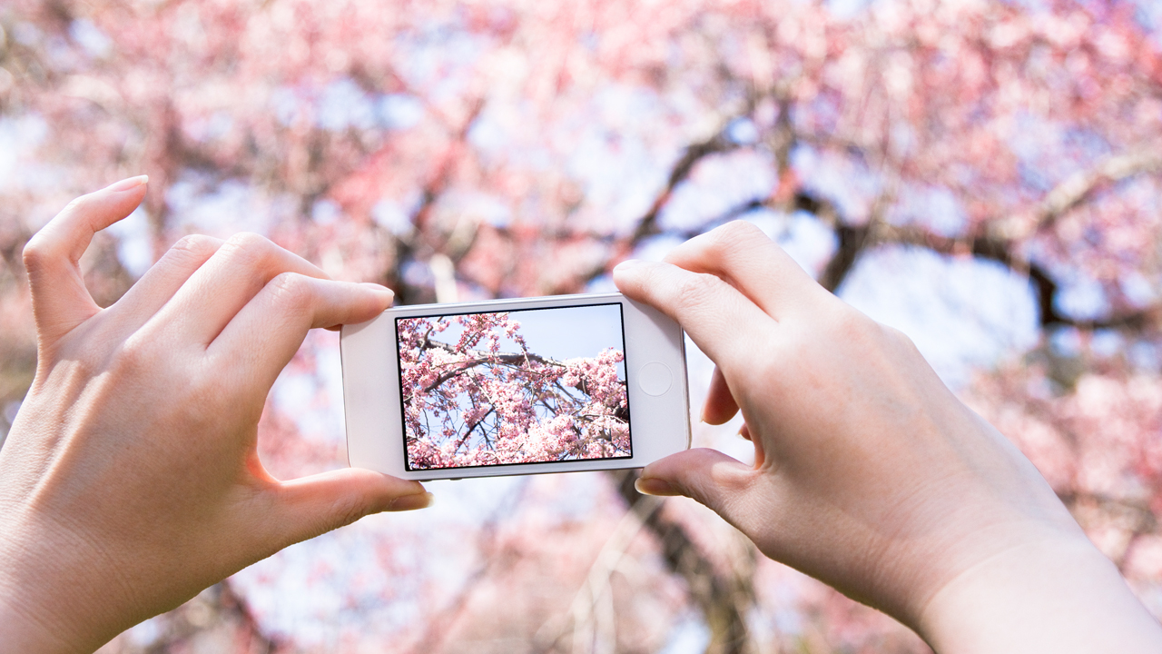
<p>Our case study was the annual spread of cherry blossom flowering across Japan, where millions of people view the blooming each year in a cultural event called “hanami”. The flowering spreads across Japan in a wave (“<a href="https://en.wikipedia.org/wiki/Cherry_blossom_front">sakura zensen</a>” or 桜前線) following the warmth of the arriving spring season.</p> <figure class="align-center "><img src="https://images.theconversation.com/files/529000/original/file-20230530-15-mix84k.jpeg?ixlib=rb-1.1.0&q=45&auto=format&w=754&fit=clip" sizes="(min-width: 1466px) 754px, (max-width: 599px) 100vw, (min-width: 600px) 600px, 237px" srcset="https://images.theconversation.com/files/529000/original/file-20230530-15-mix84k.jpeg?ixlib=rb-1.1.0&q=45&auto=format&w=600&h=399&fit=crop&dpr=1 600w, https://images.theconversation.com/files/529000/original/file-20230530-15-mix84k.jpeg?ixlib=rb-1.1.0&q=30&auto=format&w=600&h=399&fit=crop&dpr=2 1200w, https://images.theconversation.com/files/529000/original/file-20230530-15-mix84k.jpeg?ixlib=rb-1.1.0&q=15&auto=format&w=600&h=399&fit=crop&dpr=3 1800w, https://images.theconversation.com/files/529000/original/file-20230530-15-mix84k.jpeg?ixlib=rb-1.1.0&q=45&auto=format&w=754&h=501&fit=crop&dpr=1 754w, https://images.theconversation.com/files/529000/original/file-20230530-15-mix84k.jpeg?ixlib=rb-1.1.0&q=30&auto=format&w=754&h=501&fit=crop&dpr=2 1508w, https://images.theconversation.com/files/529000/original/file-20230530-15-mix84k.jpeg?ixlib=rb-1.1.0&q=15&auto=format&w=754&h=501&fit=crop&dpr=3 2262w" alt="ALT TEXT" /><figcaption><span class="caption">Celebrating the cherry blossom is a centuries-old tradition in Japan.</span> <span class="attribution"><span class="source">Shutterstock</span></span></figcaption></figure> <p>The <a href="https://en.wikipedia.org/wiki/Hanami">hanami festival</a> has been documented for centuries, and research shows climate change is making <a href="https://iopscience.iop.org/article/10.1088/1748-9326/ac6bb4">early blossoming more likely</a>. The advent of mobile phones – and social network sites that allow people to <a href="https://www.sciencedirect.com/science/article/abs/pii/S1574954116302321">upload photos tagged with time and location data</a> – presents a new opportunity to study how Japan’s flowering events are affected by seasonal climate.</p> <h2>Why are flowers useful to understand how nature is being altered by climate change?</h2> <p>Many flowering plants, including the cherry blossoms of Japan (<em>Prunus</em> subgenus <em>Cerasus</em>), require insect pollination. To reproduce, plant flowers bloom at optimal times to receive visits from insects like bees.</p> <p>Temperature is <a href="https://journals.plos.org/plosone/article?id=10.1371/journal.pone.0200549">an important mechanism</a> for plants to trigger this flowering. <a href="https://onlinelibrary.wiley.com/doi/epdf/10.1111/j.1461-0248.2008.01269.x">Previous research</a> has highlighted how climate change may create mismatches in space or time between the blooming of plants and the emergence of pollinating insects.</p> <p><iframe id="rtiQ0" class="tc-infographic-datawrapper" style="border: none;" src="https://datawrapper.dwcdn.net/rtiQ0/2/" width="100%" height="400px" frameborder="0"></iframe></p> <p>It has been difficult for researchers to map the extent of this problem in detail, as its study requires simultaneous data collection over large areas. The use of citizen science images deliberately, or incidentally, uploaded to social network sites enables <a href="https://en.wikipedia.org/wiki/Big_data">big data</a> solutions.</p> <h2>How did we conduct our study?</h2> <p>We collected images from Japan uploaded to <a href="https://www.flickr.com/">Flickr</a> between 2008 and 2018 that were tagged by users as “cherry blossoms”. We used computer vision techniques to analyse these images, and to provide sets of keywords describing their image content.</p> <p>Next, we automatically filtered out images appearing to contain content that the computer vision algorithms determined didn’t match our targeted cherry blossoms. For instance, many contained images of autumn leaves, another popular ecological event to view in Japan.</p> <p>The locations and timestamps of the remaining cherry blossom images were then used to generate marks on a map of Japan showing the seasonal wave of sakura blossoms, and to estimate peak bloom times each year in different cities.</p> <h2>Checking the data</h2> <p>An important component of any scientific investigation is validation – how well does a proposed solution or data set represent the real-world phenomenon under study?</p> <figure class="align-right zoomable"><a href="https://images.theconversation.com/files/528702/original/file-20230528-21-4fxpkv.png?ixlib=rb-1.1.0&q=45&auto=format&w=1000&fit=clip"><img src="https://images.theconversation.com/files/528702/original/file-20230528-21-4fxpkv.png?ixlib=rb-1.1.0&q=45&auto=format&w=237&fit=clip" sizes="(min-width: 1466px) 754px, (max-width: 599px) 100vw, (min-width: 600px) 600px, 237px" srcset="https://images.theconversation.com/files/528702/original/file-20230528-21-4fxpkv.png?ixlib=rb-1.1.0&q=45&auto=format&w=600&h=591&fit=crop&dpr=1 600w, https://images.theconversation.com/files/528702/original/file-20230528-21-4fxpkv.png?ixlib=rb-1.1.0&q=30&auto=format&w=600&h=591&fit=crop&dpr=2 1200w, https://images.theconversation.com/files/528702/original/file-20230528-21-4fxpkv.png?ixlib=rb-1.1.0&q=15&auto=format&w=600&h=591&fit=crop&dpr=3 1800w, https://images.theconversation.com/files/528702/original/file-20230528-21-4fxpkv.png?ixlib=rb-1.1.0&q=45&auto=format&w=754&h=743&fit=crop&dpr=1 754w, https://images.theconversation.com/files/528702/original/file-20230528-21-4fxpkv.png?ixlib=rb-1.1.0&q=30&auto=format&w=754&h=743&fit=crop&dpr=2 1508w, https://images.theconversation.com/files/528702/original/file-20230528-21-4fxpkv.png?ixlib=rb-1.1.0&q=15&auto=format&w=754&h=743&fit=crop&dpr=3 2262w" alt="" /></a><figcaption><span class="caption">Blossom dates calculated from social media images compare well with official data.</span> <span class="attribution"><span class="source">ElQadi et al.</span>, <span class="license">Author provided</span></span></figcaption></figure> <p>Our study using social network site images was validated against the detailed information published by the <a href="https://www.japan.travel/en/see-and-do/cherry-blossom-forecast-2023/">Japan National Tourism Organization</a>.</p> <p>We also manually examined a subset of images to confirm the presence of cherry flowers.</p> <p>Plum flowers (<em>Prunus mume</em>) look very similar to cherry blossoms, especially to tourists, and they are frequently mistaken and mislabelled as cherry blossoms. We used visible “notches” at the end of cherry petals, and other characteristics, to distinguish cherries from plums.</p> <p>Taken together, the data let us map the flowering event as it unfolds across Japan.</p> <figure class="align-center zoomable"><a href="https://images.theconversation.com/files/528769/original/file-20230529-17-wmgf5g.gif?ixlib=rb-1.1.0&q=45&auto=format&w=1000&fit=clip"><img src="https://images.theconversation.com/files/528769/original/file-20230529-17-wmgf5g.gif?ixlib=rb-1.1.0&q=45&auto=format&w=754&fit=clip" sizes="(min-width: 1466px) 754px, (max-width: 599px) 100vw, (min-width: 600px) 600px, 237px" srcset="https://images.theconversation.com/files/528769/original/file-20230529-17-wmgf5g.gif?ixlib=rb-1.1.0&q=45&auto=format&w=600&h=619&fit=crop&dpr=1 600w, https://images.theconversation.com/files/528769/original/file-20230529-17-wmgf5g.gif?ixlib=rb-1.1.0&q=30&auto=format&w=600&h=619&fit=crop&dpr=2 1200w, https://images.theconversation.com/files/528769/original/file-20230529-17-wmgf5g.gif?ixlib=rb-1.1.0&q=15&auto=format&w=600&h=619&fit=crop&dpr=3 1800w, https://images.theconversation.com/files/528769/original/file-20230529-17-wmgf5g.gif?ixlib=rb-1.1.0&q=45&auto=format&w=754&h=777&fit=crop&dpr=1 754w, https://images.theconversation.com/files/528769/original/file-20230529-17-wmgf5g.gif?ixlib=rb-1.1.0&q=30&auto=format&w=754&h=777&fit=crop&dpr=2 1508w, https://images.theconversation.com/files/528769/original/file-20230529-17-wmgf5g.gif?ixlib=rb-1.1.0&q=15&auto=format&w=754&h=777&fit=crop&dpr=3 2262w" alt="An animated map showing cherry blossom flowering across Japan" /></a><figcaption><span class="caption">Images uploaded to social media over a ten year period 2008-2018, let us map the cherry blossom front as it sweeps across Japan.</span> <span class="attribution"><span class="source">ElQadi et al.</span>, <span class="license">Author provided</span></span></figcaption></figure> <h2>Out-of-season blooms</h2> <p>Our social network site analysis was sufficiently detailed to accurately pinpoint the annual peak spring bloom in the major cities of <a href="https://en.wikipedia.org/wiki/Tokyo">Tokyo</a> and <a href="https://en.wikipedia.org/wiki/Kyoto">Kyoto</a>, to within a few days of official records.</p> <p>Our data also revealed the presence of a consistent, and persistent, out-of-season cherry bloom in autumn. Upon further searching, we discovered that this “unexpected” seasonal bloom had also been noted in <a href="https://www.bbc.com/news/world-asia-45898333">mainstream media</a> in recent years. We thus confirmed that this is a real event, not an artefact of our study.</p> <figure class="align-center zoomable"><a href="https://images.theconversation.com/files/528832/original/file-20230529-25-wonef0.png?ixlib=rb-1.1.0&q=45&auto=format&w=1000&fit=clip"><img src="https://images.theconversation.com/files/528832/original/file-20230529-25-wonef0.png?ixlib=rb-1.1.0&q=45&auto=format&w=754&fit=clip" sizes="(min-width: 1466px) 754px, (max-width: 599px) 100vw, (min-width: 600px) 600px, 237px" srcset="https://images.theconversation.com/files/528832/original/file-20230529-25-wonef0.png?ixlib=rb-1.1.0&q=45&auto=format&w=600&h=450&fit=crop&dpr=1 600w, https://images.theconversation.com/files/528832/original/file-20230529-25-wonef0.png?ixlib=rb-1.1.0&q=30&auto=format&w=600&h=450&fit=crop&dpr=2 1200w, https://images.theconversation.com/files/528832/original/file-20230529-25-wonef0.png?ixlib=rb-1.1.0&q=15&auto=format&w=600&h=450&fit=crop&dpr=3 1800w, https://images.theconversation.com/files/528832/original/file-20230529-25-wonef0.png?ixlib=rb-1.1.0&q=45&auto=format&w=754&h=566&fit=crop&dpr=1 754w, https://images.theconversation.com/files/528832/original/file-20230529-25-wonef0.png?ixlib=rb-1.1.0&q=30&auto=format&w=754&h=566&fit=crop&dpr=2 1508w, https://images.theconversation.com/files/528832/original/file-20230529-25-wonef0.png?ixlib=rb-1.1.0&q=15&auto=format&w=754&h=566&fit=crop&dpr=3 2262w" alt="" /></a><figcaption><span class="caption">Cherry blossom photographs from Flickr taken within Japan from 2008 to 2018 show an April peak as well as an unexpected smaller peak in November.</span> <span class="attribution"><span class="source">ElQadi et al.</span>, <span class="license">Author provided</span></span></figcaption></figure> <p>So, even without knowing it, many of us are already helping to understand how climate change influences our environment, simply by posting online photographs we capture. Dedicated sites like <a href="https://wildpollinatorcount.com/">Wild Pollinator Count</a> are excellent resources to contribute to the growing knowledge base.</p> <p>The complex issues of climate change are still being mapped. Citizen science allows our daily observations to improve our understanding, and so better manage our relationship with the natural world.<!-- Below is The Conversation's page counter tag. Please DO NOT REMOVE. --><img style="border: none !important; box-shadow: none !important; margin: 0 !important; max-height: 1px !important; max-width: 1px !important; min-height: 1px !important; min-width: 1px !important; opacity: 0 !important; outline: none !important; padding: 0 !important;" src="https://counter.theconversation.com/content/206574/count.gif?distributor=republish-lightbox-basic" alt="The Conversation" width="1" height="1" /><!-- End of code. If you don't see any code above, please get new code from the Advanced tab after you click the republish button. The page counter does not collect any personal data. More info: https://theconversation.com/republishing-guidelines --></p> <p><a href="https://theconversation.com/profiles/adrian-dyer-387798">Adrian Dyer</a>, Associate Professor, <em><a href="https://theconversation.com/institutions/monash-university-1065">Monash University</a></em>; <a href="https://theconversation.com/profiles/alan-dorin-12573">Alan Dorin</a>, Associate Professor, Faculty of Information Technology, <em><a href="https://theconversation.com/institutions/monash-university-1065">Monash University</a></em>; <a href="https://theconversation.com/profiles/carolyn-vlasveld-1442834">Carolyn Vlasveld</a>, PhD candidate, <em><a href="https://theconversation.com/institutions/monash-university-1065">Monash University</a></em>, and <a href="https://theconversation.com/profiles/moataz-elqadi-1442833">Moataz ElQadi</a>, Adjunct Researcher, Faculty of Information Technology, <em><a href="https://theconversation.com/institutions/monash-university-1065">Monash University</a></em></p> <p><em>This article is republished from <a href="https://theconversation.com">The Conversation</a> under a Creative Commons license. Read the <a href="https://theconversation.com/social-media-snaps-map-the-sweep-of-japans-cherry-blossom-season-in-unprecedented-detail-206574">original article</a>.</em></p> <p><em>Images: Getty</em></p>

Technology

Placeholder Content Image

New study reveals the lifetime health benefits of social interaction

<p dir="ltr">A new meta-analysis study - undertaken by the Centre for Healthy Brain Ageing (otherwise known as the CHeBA) at the University of New South Wales - has revealed that social interaction could have benefits many would never have thought to predict, from a reduced risk of dementia to overall increased longevity. </p> <p dir="ltr">Researches were investigating the link between social connections in senior citizens and the risk of mild cognitive impairment (MCI), as well as dementia and morality, compiling the results from 13 other international studies following individuals aged 65 years and up over extended periods of time - research published in <em><a href="https://u26892420.ct.sendgrid.net/ls/click?upn=B8NE7CRkW4hCmh1dHfJbPqy22DjCz8-2Bq3ZidKWozGaZDoG-2FmVx-2BVsAja535jGrbQlYGwKkrcgY4HPBHrSRE-2Bpq1fwuJ0AQZcKTgnOiva5gsjqRFzNLSYGGzJ4hgT-2Bp0b-7Jp_W1g0lLgOQvKHpoedb1QOitWbx1JxegS3ChuQBoUMMSvQphp8oKfzCnK1hk7FLUZqqTLorFP-2FYQB6URmHLHx65PjMZSysYz3YQI-2BzvIxBhVdZr2Z1gRzt72cMfkaib4uVOYXTxECJWWsRmLyHtb8tdUoPs6u4lvqr8I7xD4zbJqJTqeP2zMO2vFFc6dcczrApzJnOWkq2tOchRyvzstzbQnlU1N4WSe4ZAMtqjmGx6sSvfxYICFLpppnmosd6kUUL-2B2zjjEQ61i38e9TYUaT6LZA5aIGcpHJw26Ob-2BXzuvv-2BuHbhihyIqh2AUTJ2WAYsCw6hpo5SJ7JKlgCF4nYeiekLQeVVLm4GRjjckYyIIN48-3D">Alzheimer's & Dementia: The Journal of the Alzheimer's Association</a></em>.</p> <p dir="ltr">As author, clinical psychologist, and researcher Dr Suraj Samtani explained, “we know from previous research that social connections are important for our health and being isolated puts us at higher risk of dementia and death.”</p> <p dir="ltr">“Our goal was to find which social connections protect us from dementia and death.”</p> <p dir="ltr">Researches drew intel from studies in a number of countries - spanning low, middle, and high-income nations - and compiled a study population more diverse than the meta-analyses to come before, including the likes of Australia, European nations, North and South America, Asia, and Africa, as opposed to the previous North America and European study groups.</p> <p dir="ltr">From there, they looked at information about the connections between the participants, paying close attention to the types of social links (whether they were in a relationship, single, or married, or involved with their community), the function of them (whether or not they had social support on hand, or a close confidante), and the quality (how much satisfaction they did - or did not - receive from their relationships).</p> <p dir="ltr">With this information, they sought to find out if the participants had developed either MCI or dementia - as well as whether or not they had passed away.</p> <p dir="ltr">“We looked at social variables across these studies, such as living with others, interacting with friends and family, engaging in community activities, and social support,” Dr Samtani  said. “We wanted to know which of these are associated with risk of getting dementia over time or dying.”</p> <p dir="ltr">And from their research, they discovered that positive social connections did appear to be linked to a lower risk of MCI, dementia, and death. </p> <p dir="ltr">“We found that frequent interactions - monthly or weekly - with family and friends and having someone to talk to reduced the risk of getting dementia. We also found that living with others and doing community activities reduced the risk of dying,” Dr Samtani noted.</p> <p dir="ltr">Recommendations from the researchers suggest that people should be prioritising their social connections if they hope to reduce their risk of cognitive decline - with the added benefit of living longer, too. </p> <p dir="ltr">“Try to meet with friends and family at least once a month, take part in community activities like volunteering or a rotary club, and open your heart to someone when you feel stressed,” Dr Samtani said. “Living with others, for example in an intergenerational household, is also helpful.</p> <p dir="ltr">“Connecting with others helps us to keep our bodies and minds healthy.</p> <p dir="ltr">“We hope that helping people to stay engaged in conversations and maintain healthy friendships and relationships will help them to stay healthy and happy.”</p> <p dir="ltr"><em>Images: Getty </em></p>

Relationships

Placeholder Content Image

The ultimate travel guide for film fanatics

<p>More often than not, the stunning landscapes and sweeping vistas in film and television leave audiences craving a trip to fantasy worlds, with little to no idea how to get there.</p> <p>And for the talented team over at SetJetters, this was a problem they had to tackle. From their efforts came “the best way to search for, navigate to, and share your trips to the great film and television locations around the world”, all with their handy dandy “handheld travel guide”.</p> <p>SetJetters is a free app that allows people all across the globe to find the real-world locations where some of their favourite moments from the screen were filmed, and even offers them the opportunity to upload their own images and share their thoughts with fellow film fanatics. </p> <p>“Whether you’re a location geek out in the field or a film buff binge-watching at home and wondering where a great scene was filmed, SetJetters will not only help you find the answer – but also help you get to the location and right into the action,” SetJetters’ official Instagram account explained in a post. </p> <p>“Whether it’s close to home or across the globe, SetJetters is designed to be your handheld travel guide to the most exciting film locations, from the biggest studio franchises – like <em>Lord of the Rings</em>, <em>Star Wars</em>, <em>Game of Thrones</em>, and <em>Mission: Impossible</em> – to smaller independent films and classics.”</p> <p>And as Erik Nachtriev - a former filmmaker and co-founder of SetJetters - explained to Andrew Bucklow on the <em>I’ve Got News For You </em>podcast, the idea came about for the group during the height of the Covid-19 pandemic. And they have no intentions of slowing down any time soon, with so much more still to be added to their passion project. </p> <p>“We have 91,000 movies, but we only have 6000 published, so you can see we have a lot of work to do as far as movies [go],” he said. </p> <p>“We actually intend to have movies in the hundreds of thousands eventually.”</p> <p>The team also hope to one day have enough data that they can determine the world’s most popular scenes and locations, something they believe may assist local economies in understanding the impact of big screen tourism in their area. </p> <p>“The biggest scenes, I would say, the craziest people about scenes are Twilight people. And the people who love the movie The Goonies from the ’80s,” he said of their findings so far, before adding that while their app has a global reach, most of its locations are focussed where the app originated - the United States of America.</p> <p>As well as its innovative map, the app also features something it calls the ‘ShotSync camera’, which allows users to place themselves directly into their favourite on-screen scenes.</p> <p>“We find that a lot of users like to take a picture immersing themselves in the scene. They want to be right where their favourite actor stood or inside their favourite scene,” Nachtriev explained. </p> <p>“There’s a really large emotional attachment to the scene and reliving it, so this was a way that we could develop this for them.</p> <p>“You bring up your camera and there’s a slider on your camera that comes up inside the app, and it shows the image of the scene. Whoever is taking the picture can slide the slider back and forth to make it transparent, so you can line it up almost exactly. You can even cosplay with your favourite costume.</p> <p>“Take the picture. It’ll show [it] like how it was in the movie and how it is with you there. A lot of the background changes. </p> <p>“People love that ‘then and now’ kind of thing.”</p> <p><em>Images: setjetters.com, @setjetters / Instagram</em></p>

Domestic Travel

Placeholder Content Image

Interactive cinema: how films could alter plotlines in real time by responding to viewers’ emotions

<p>Most films offer exactly the same viewing experience. You sit down, the film starts, the plot unfolds and you follow what’s happening on screen until the story concludes. It’s a linear experience. My new film, <a href="http://www.albinomosquito.com/before-we-disappear/">Before We Disappear</a> – about a pair of climate activists who seek revenge on corporate perpetrators of global warming – seeks to alter that viewing experience.</p> <p>What makes my film different is that it adapts the story to fit the viewer’s emotional response. Through the use of a computer camera and software, the film effectively watches the audience as they view footage of climate disasters. Viewers are implicitly asked to choose a side.</p> <p>I chose to use this technology to make a film about the climate crisis to get people to really think about what they are willing to sacrifice for a survivable future.</p> <p>Storytelling has always been interactive: traditional oral storytellers would interact and respond to their listeners. For almost a century, film directors have been <a href="https://en.wikipedia.org/wiki/Interactive_cinema">experimenting with interactivity</a> – the past decade has seen an explosion of interactive content.</p> <p>Streaming services give viewers the opportunity to choose their own adventure. However, letting the viewer control the action has long posed a challenge: it’s at odds with narrative immersion, where the viewer is drawn into the world created by the story.</p> <p>One of the most prominent recent experiments in interactive film, <a href="https://en.wikipedia.org/wiki/Black_Mirror:_Bandersnatch">Netflix’s Bandersnatch</a>, clearly illustrates this. Here the action stops to ask the user what to do next – breaking the flow of the story and actively involving the viewer. Solving this issue of breaking the immersive experience remains a key question for artists exploring interactive film.</p> <p>The films I create and direct take a different route, leveraging non-conscious control to influence a film as the audience watches. My previous <a href="http://braincontrolledmovie.co.uk/">brain-controlled</a> films, <a href="https://www.imdb.com/title/tt7853742/">The Moment (2018)</a> and <a href="https://www.imdb.com/title/tt8072006/">The Disadvantages of Time Travel (2014)</a>, used brain computer interfaces (BCIs). These systems use computers to <a href="https://nottingham-repository.worktribe.com/output/980302/scanners-exploring-the-control-of-adaptive-films-using-brain-computer-interaction">analyse electrical signals from the brain</a>, allowing people to effectively control a device with their minds.</p> <p>Using this data from the brain, audiences <a href="https://nottingham-repository.worktribe.com/index.php/output/1468705/from-directors-cut-to-users-cut-to-watch-a-brain-controlled-film-is-to-edit-it">create a non-conscious edit</a> of the film in real time – reinforcing the films’ respective stories of science-fiction dystopia and a wandering, daydreaming mind.</p> <p>However, the BCI interface requires specialised equipment. For Before We Disappear, I wanted to use a technology more readily available to audiences, that could allow films to be shared over the internet.</p> <h2>Controlling the narrative</h2> <p>Before We Disappear uses an ordinary computer camera to read emotional cues and instruct the real-time edit of the film. To make this work, we needed a good understanding of how people react to films.</p> <p>We ran several <a href="https://dl.acm.org/doi/10.1145/3290607.3312814">studies</a> <a href="https://dl.acm.org/doi/10.1145/3290605.3300378">exploring the emotions</a> filmmakers intend to evoke and how viewers visually present emotion when watching. By using computer vision and machine learning techniques from our partner <a href="https://www.blueskeye.com/">BlueSkeye AI</a>, we analysed viewers’ facial emotions and reactions to film clips and developed several algorithms to leverage that data to control a narrative.</p> <p>While we observed that audiences tend not to extensively emote when watching a film, BlueSkeye’s face and emotion analysis tools are sensitive enough to pick up enough small variations and emotional cues to adapt the film to viewer reactions.</p> <p>The analysis software measures facial muscle movement along with the strength of emotional arousal – essentially how emotional a viewer feels in a particular moment. The software also evaluates the positivity or negativity of the emotion – something we call “<a href="https://www.frontiersin.org/articles/10.3389/fpsyg.2013.00261/full">valence</a>”.</p> <p>We are experimenting with various algorithms where this arousal and valence data contributes to real-time edit decisions, which causes the story to reconfigure itself. The first scene acts as a baseline, which the next scene is measured against. Depending on the response, the narrative will become one of around 500 possible edits. In Before We Disappear, I use a non-linear narrative which offers the audience different endings and emotional journeys.</p> <h2>Emotional journey</h2> <p>I see interactive technology as a way of expanding the filmmaker’s toolkit, to further tell a story and allow the film to adapt to an individual viewer, challenging and distributing the power of the director.</p> <p>However, emotional responses could be misused or have unforeseen consequences. It is not hard to imagine an online system showing only content eliciting positive emotions from the user. This could be used to create an echo chamber – where people only see content that matches the preferences they already have.</p> <p>Or it could be used for propaganda. We saw in the Cambridge Analytica scandal how <a href="https://en.wikipedia.org/wiki/Facebook%E2%80%93Cambridge_Analytica_data_scandal">large amounts of personal information</a> were collected from Facebook and used for political advertising.</p> <p>Our <a href="https://www.researchgate.net/publication/348325526_Brain-controlled_cinematic_interactions">research</a> aims to generate conversation about how users’ emotion data can be used responsibly with informed consent, while allowing users to control their own personal information. In our system, the data is analysed on the users’ device, rather than, say, the cloud.</p> <h2>Big business, big responsibility</h2> <p>Non-conscious interaction is big business. Platforms such as <a href="https://www.nbcnews.com/tech/social-media/algorithms-take-over-youtube-s-recommendations-highlight-human-problem-n867596">TikTok</a> and <a href="https://www.nbcnews.com/tech/social-media/algorithms-take-over-youtube-s-recommendations-highlight-human-problem-n867596">YouTube</a> use analysis of users’ past interactions on the platforms to influence the new content they see there. Users are not always aware of what personal information is being created or stored, nor can they influence what algorithms will present to them next.</p> <p>It’s important to create a system where audiences’ data is not stored. Video of the viewer or facial expression data should not be uploaded or analysed anywhere but on the player device. We plan to release the film as an interactive app, incorporating an awareness of potential abuse of the user’s data, and safeguarding any personal data on the device used to watch it.</p> <p>Adaptive films offer an alternative to traditional “choose-your-own-adventure” storytelling. When the story can change based on the audiences’ unconscious responses rather than intentional interaction, their focus can be kept in the story.</p> <p>This means they can enjoy a more personalised experience of the film. Turns out the old traditions of storytelling may still have much to teach us in the 21st century.</p> <p><em>This article originally appeared on <a href="https://theconversation.com/interactive-cinema-how-films-could-alter-plotlines-in-real-time-by-responding-to-viewers-emotions-200145" target="_blank" rel="noopener">The Conversation</a>.</em></p> <p><em>Images: Getty</em></p>

Movies

Placeholder Content Image

This is our most detailed map of the brain’s memory centre

<p dir="ltr">Australian researchers have created the most detailed map we have of the hippocampus - the brain’s memory control centre - which could change the way we think about memory.</p> <p dir="ltr">The hippocampus, a complex structure that looks like a seahorse, is located deep within the brain. It plays a vital role in forming memories and transferring memories from short-term to long-term storage, as well as in navigation, creating mental images, visual perception, decision making, and imagining fictitious or future experiences.</p> <p dir="ltr">The team of scientists from the University of Sydney created the map using MRI scans from a database created for the Human Connectome Project, and used techniques they developed to follow connections from all different parts of the brain to the hippocampus.</p> <p dir="ltr">“What we’ve done is take a much more detailed look at the white matter pathways, which are essentially the highways of communication between different areas of the brain,” said Dr Marshall Dalton, a Research Fellow in the School of Psychology.</p> <p dir="ltr">“And we developed a new approach that allowed us to map how the hippocampus connects with the cortical mantle, the outer layer of the brain, but in a very detailed way.</p> <p dir="ltr">“What we’ve created is a highly detailed map of white matter pathways connecting the hippocampus with the rest of the brain. It’s essentially a roadmap of brain regions that directly connect with the hippocampus and support its important role in memory formation.”</p> <p><span id="docs-internal-guid-226e8497-7fff-2949-ca9f-17daa0026428"></span></p> <p dir="ltr">Mapping the brain in this way has never been done before, due to technical limitations that only allowed connections between the hippocampus and other parts of the brain to be visualised in broad terms.</p> <p dir="ltr"><img src="https://oversixtydev.blob.core.windows.net/media/2022/11/brain-diagram.jpg" alt="" width="1280" height="720" /></p> <p dir="ltr"><em>The seahorse-shaped hippocampus is located deep within the brain, and now scientists have created a detailed map of the connections between it and the frontal cortex and amygdala. Image: Wikimedia</em></p> <p dir="ltr">This scientific first has also come with some surprising discoveries that could change our understanding of human memory.</p> <p dir="ltr">While they found that their results mostly aligned with previous studies on primate brains, the team found that the number of connections between the hippocampus and some brain areas differed from what they expected.</p> <p dir="ltr">“We were surprised to find fewer connections between the hippocampus and frontal cortical areas, and more connections with early visual processing areas than we expected to see,” Dr Marshall said.</p> <p dir="ltr">“Although, this makes sense considering the hippocampus plays an important role not only in memory but also imagination and our ability to construct mental images in our mind’s eye.”</p> <p dir="ltr"><span id="docs-internal-guid-d58ff870-7fff-48bb-dc67-b34c0982779c"></span></p> <p dir="ltr">Although the differences in the number of connections could be a result of limitations of MRIs, they could also explain some of the differences between humans and our primate cousins, particularly when it comes to short-term memory.</p> <p dir="ltr"><iframe title="YouTube video player" src="https://www.youtube.com/embed/fj7lARXjrVY" width="560" height="315" frameborder="0" allowfullscreen="allowfullscreen"></iframe></p> <p dir="ltr">For example, chimpanzees have beaten humans at cognitive tasks that use game theory, a form of mathematics that relies on short-term memory, pattern recognition and rapid visual assessment.</p> <p dir="ltr">“Although we have achieved this high-resolution mapping of the human hippocampus, the tract tracing method conducted on non-human primates – which can see down to the cellular level – is able to see more connections than can be discerned with an MRI,” mused Dr Dalton.</p> <p dir="ltr">“Or it could be that the human hippocampus really does have a smaller number of connections with frontal areas than we expect, and greater connectivity with visual areas of the brain. As the neocortex expanded, perhaps humans evolved different patterns of connectivity to facilitate human-specific memory and visualisation functions which, in turn, may underpin human creativity.</p> <p dir="ltr">“It’s a bit of a puzzle – we just don’t know. But we love puzzles and will keep investigating.”</p> <p dir="ltr">The team published their findings in the journal <em><a href="https://doi.org/10.7554/eLife.76143" target="_blank" rel="noopener">Neuroscience</a></em>.</p> <p dir="ltr"><span id="docs-internal-guid-315f2b1e-7fff-62ef-0701-027552b6b343"></span></p> <p dir="ltr"><em>Image: Human Connectome Project</em></p>

Mind

Placeholder Content Image

Mapping the labour and slavery risks in fashion supply chains

<div class="copy"> <p>How did your clothes get to you, and who was properly paid for them in the process?</p> <p>The garment industry is notorious for worker exploitation and complicated, unclear supply chains.</p> <p>Both within and without the fashion industry, forced labour, and modern slavery, is on the rise. According to the new <a href="https://publications.iom.int/books/global-estimates-modern-slavery-forced-labour-and-forced-marriage" target="_blank" rel="noreferrer noopener">Global Estimates of Modern Slavery</a> report, there were 50 million people around the world living in modern slavery: 28 million in forced labour, and 22 million in forced marriages.</p> <p>This is an increase of 10 million from when the report was done in 2016 – among other things, the number has been exacerbated by the COVID-19 pandemic, climate change and armed conflicts.</p> <p>What does the garment supply chain look like? <em>Cosmos</em> investigates.</p> <h2>The shape of the garment industry: four tiers (sort of)</h2> <p>“In a broad sense, when retailers talk about their supply chains, they tend to talk with tiers zero to four,” explains Dr Alice Payne, an associate professor in fashion at Queensland University of Technology.</p> <p>Tier 0 is the company’s direct operations: retail, offices, and distribution centres, for instance. Each additional tier is a layer removed from them.</p> <p>“Tier 1 is the people and the organizations constructing the garments for them – so assembling and manufacturing,” says Payne.</p> <p>Tier 2 is fabric production, while Tier 3 is the production of the yarn that makes the fabric.</p> <p>“Tier 4 is raw materials,” says Payne.</p> <p>“Natural fibres like cotton and wool, that’s all the way back to the farm, or the forests that the trees come from that are then processed into viscose material. And the petrochemical industry, which is the feedstock for polyester, nylons, acrylics and so on.”</p> <p>In reality, there aren’t clear lines between these tiers – particularly further up the supply chain.</p> <p>Even something as ubiquitous as cotton has a very complicated history.</p> <p>“You’ve got the seed inputs to grow the cotton on the farm, the cotton has to be ginned – the seed and the lint separated – and then from the ginning, it’s shipped to a spinner to make it into a yarn.</p> <p>“Then the yarn producer will ship it often to other countries to be manufactured into a cloth. At any point along the chain, it might be dyed,” says Payne.</p> <p>“They can span the world over in terms of geographic location and can be really complex,” says Abigail Munroe, a modern slavery research and policy analyst at human rights group Walk Free, which compiled the <em>Global Estimates of Modern Slavery </em>report with the United Nation’s International Labour Organization and the International Organisation for Migration.</p> <h2>The labour distribution along the supply chain</h2> <p>Workers aren’t distributed evenly across these tiers. Spindles and looms are both highly mechanised processes, making the middle tiers less labour-intensive. The raw materials in Tier 4 can be equally mechanised, or labour-intensive to make, depending on the fibre.</p> <p>Assembling garments in Tier 1, however, demands a huge workforce.</p> <p>“It’s part of the nature of cloth – it’s fluid and malleable,” says Payne.</p> <p>“In the robotics space, they talk about how it might take months to teach a machine to fold a t -shirt because it’s just such a such a very difficult thing to manoeuvre and manipulate cloth.”</p> <p>Each seam on your clothes needs to be guided manually through a sewing machine – which is something of a boon for poorer countries wanting to bring in more industry.</p> <p>“The textile industry is often the first rung on the ladder for a country that’s industrialising,” says Payne.</p> <p>“What’s an industry to bring into a country when you’ve got a large labour force? Well, often garment assembly, because it’s fairly light machinery.”</p> <p>But this also comes with risks.</p> <h2>Who gets paid</h2> <p>According to the <a href="https://cleanclothes.org/poverty-wages" target="_blank" rel="noreferrer noopener">Clean Clothes Campaign</a>, a T-shirt which sells for €29 (A$43) sends €0.18 (A$0.27) back to the Bangladeshi garment worker who sewed it.</p> <p>Walk Free’s <a href="https://www.walkfree.org/reports/beyond-compliance-in-the-garment-industry/" target="_blank" rel="noreferrer noopener"><em>Beyond Compliance in the Garment Industry</em></a> report has found similar levels of low payment across the supply chain.</p> <p>“In our assessment, workers would need to be earning almost 40% more to have their basic needs met,” says Munroe.</p> <p>Exploitation may be worse in the more distant tiers.</p> <p>“In general, across any kind of industry, workers further down the supply chains tend to face increased modern slavery risks,” says Munroe.</p> <p>“That can be for a number of reasons – some of these being that they’re more likely to work in the informal economy, and they’re more likely to be invisible to policies designed to protect them.”</p> <p><iframe title="Huh? Science Explained" src="https://omny.fm/shows/huh-science-explained/playlists/podcast/embed?selectedClip=c7003c2f-954f-4ebf-b826-af090009d3ac&amp;style=cover&amp;autoplay=0&amp;list=0" width="100%" height="180" frameborder="0"></iframe></p> <h2>Tracing slavery</h2> <p>Governments have taken steps to make companies monitor these supply chains, but there are still gaps in the legislation.</p> <p>In Australia, for instance, the <a href="https://www.legislation.gov.au/Details/C2018A00153" target="_blank" rel="noreferrer noopener">2018 Modern Slavery Act</a> requires companies with an annual revenue over A$100 million to produce annual reports on their supply chains and modern slavery risks within those chains. The UK has <a href="https://www.legislation.gov.uk/ukpga/2015/30/contents/enacted" target="_blank" rel="noreferrer noopener">similar legislation</a>.</p> <p>Walk Free’s annual <em>Beyond Compliance </em>reports, track these disclosures and so far, they’ve looked at the hospitality, finance, and garment industries.</p> <p>While most of the garment companies in this year’s analysis had statements addressing modern slavery (an improvement on the hospitality and finance industries), 33% still didn’t meet minimum requirements set out by the acts. Over a quarter of companies didn’t produce any supply chain disclosure at all, while among those that did disclose, only 35% went beyond Tier 1.</p> <p>“There’s actually no penalties for companies that are within the threshold of the act, but don’t actually produce a statement,” says Munroe.</p> <p>And, even if those requirements are met, there’s little motivation to improve on reports.</p> <p>“We certainly see statements that are clearly being used as a box ticking activity,” says Munroe.</p> <p>“For both of those acts, even the Australian act which has more involved requirements, it’s completely disclosure-based. So simply reporting that the company needs to do more in relation to supply chain mapping or risk assessment – that’s enough.”</p> <p>Stricter legislation, such as the regulations <a href="https://www.csis.org/analysis/european-union-releases-draft-mandatory-human-rights-and-environmental-due-diligence" target="_blank" rel="noreferrer noopener">currently being proposed by the EU</a>, might include financial penalties for failing to comply, alongside obligations to prevent and mitigate human rights abuses right through the supply chain.</p> <p>The Australian government is <a href="https://consultations.ag.gov.au/crime/modern-slavery-act-review/" target="_blank" rel="noreferrer noopener">currently reviewing</a> its modern slavery act, with a consultation period closing in just over a month.</p> <p>Future changes to the act might increase compliance – but for now, most of the places you buy clothes from aren’t making it clear where the garments have come from – or who’s being properly paid to make them.</p> <p><em>Image credits: Getty Images</em></p> <p><em><!-- Start of tracking content syndication. Please do not remove this section as it allows us to keep track of republished articles --> <img id="cosmos-post-tracker" style="opacity: 0; height: 1px!important; width: 1px!important; border: 0!important; position: absolute!important; z-index: -1!important;" src="https://syndication.cosmosmagazine.com/?id=213724&amp;title=Mapping+the+labour+and+slavery+risks+in+fashion+supply+chains" width="1" height="1" /> <!-- End of tracking content syndication --></em></div> <div id="contributors"> <p><em>This article was originally published on <a href="https://cosmosmagazine.com/people/garment-supply-chain-slavery/" target="_blank" rel="noopener">cosmosmagazine.com</a> and was written by Ellen Phiddian. </em></p> </div>

Beauty & Style

Placeholder Content Image

Robert Irwin’s awkward fan interaction

<p dir="ltr">Robert Irwin has accidentally rejected an American tourist who may be in love with him after “missing” her message. </p> <p dir="ltr">The son of the great Steve Irwin was called cute by Megan Grass after he completed a show at Australia Zoo. </p> <p dir="ltr">She shared the footage to <a href="https://www.tiktok.com/@megangrass12/video/7109012062063562030?is_copy_url=1&amp;is_from_webapp=v1" target="_blank" rel="noopener">TikTok</a> of her complimenting him before asking for his number to a round of laughter. </p> <p dir="ltr">Robert said he was “flattered” and proceeded to ask where she was from to which she responded Utah, America. </p> <p dir="ltr">“Utah is great. I’ll tell you what, the easiest way is literally on Instagram so my people can monitor and see where it comes from because my number is hit and miss,” he said to her.</p> <p dir="ltr">Megan then to his surprise revealed that she had in fact messaged the night before to let him know she was going to Australia Zoo. </p> <p dir="ltr">He asked for her name and said “I’ll look it up” before waving and putting his thumb up. </p> <p dir="ltr">It however appears that Robert did not “look up” Megan as she is yet to receive any form of communication from him. </p> <p dir="ltr">"I think it definitely paid off because I got the opportunity to meet Robert, which is really cool," she said on <em>The Today Show</em>. </p> <p dir="ltr">"I definitely was not expecting it to blow up the way it did but it was a really cool experience all together and Robert was so sweet about it."</p> <p dir="ltr">When asked about what she liked about Robert, Megan said it was the fact that “he’s a great guy all together”.</p> <p dir="ltr">"I just think he's literally the sweetest person ever, like I was a stranger who asked for his number and he didn't have to be polite about it but he definitely was," she continued. </p> <p dir="ltr">"Robert's also like really busy and if he sees it [her message], he sees it, and if he doesn't, it's totally okay."</p> <p dir="ltr"><em>Images: TikTok/Today</em></p>

Relationships

Placeholder Content Image

Mapping memories in the brain

<p>More than a century ago, <a href="https://cosmosmagazine.com/health/building-memory-in-the-early-years/" target="_blank" rel="noreferrer noopener" data-type="URL" data-id="https://cosmosmagazine.com/health/building-memory-in-the-early-years/">memory</a> pioneer <a href="https://www.sciencedirect.com/science/article/abs/pii/S0022537178904437" target="_blank" rel="noreferrer noopener" data-type="URL" data-id="https://www.sciencedirect.com/science/article/abs/pii/S0022537178904437">Richard Semon</a> predicted a “unified engram complex”, that is, a complex of connected brain regions that would all be involved in the recall of a single memory.</p> <p>Now, a new study by researchers at the Picower Institute for Learning and Memory at MIT, US, suggests Semon may have been on to something. Evidence is mounting that a single memory dances across many different brain regions at once, linked to clusters of memory recall-cells called engrams.</p> <p>In the new <a href="https://dx.doi.org/10.1038/s41467-022-29384-4" target="_blank" rel="noreferrer noopener">study</a>, published in <em>Nature Communications, </em>the team of researchers identified and ranked dozens of areas that hadn’t previously been thought associated with memory. By conducting experiments on mice in the lab, they ultimately built a huge map of all the brain regions that seem involved with the art of remembering.</p> <p>So, how did they do it?</p> <p><strong>Mapping memory in mice</strong></p> <p>To test which brain regions might be roped into memory recall, the team performed a set of experiments on mice. Firstly, they analysed 247 brain regions in mice  that were taken from their home cage to another cage where they were exposed to a small but memorable electrical zap.</p> <p>In one group of mice, their neurons were engineered to become fluorescent when they expressed a gene required for memory encoding (i.e. storing the information as a memory). In another group, cells activated by remembering the electrical zap were fluorescently labelled. </p> <p>Once the mouse brains were preserved, the researchers could use a computer to count the fluorescing cells in each sample. This allowed them to create a brain map of regions with a clear link to memory encoding <em>and </em>memory recall. </p> <p>By comparing these mapped regions to the brains of control mice that weren’t exposed to zaps, they were able to discount certain regions, and produce a ranked order of 117 regions with a clear likelihood of involvement in memory.</p> <p>To really be an engram cell, the authors theorised, a neuron should be activated in both the encoding (recording) and recall (remembering) of a memory.</p> <p><iframe src="//players.brightcove.net/5483960636001/HJH3i8Guf_default/index.html?videoId=6303670603001" width="528" height="300" frameborder="0" allowfullscreen="allowfullscreen"></iframe></p> <p><em>Many brain regions found likely to be involved in encoding a memory (top) were also found to be involved in recall upon reactivation (bottom). Credit: Tonegawa Lab/MIT Picower Institute</em></p> <p>What they found was a massive engram complex.</p> <p>“These experiments not only revealed significant engram reactivation in known hippocampal and amygdala regions, but also showed reactivation in many thalamic, cortical, midbrain and brainstem structures,” the authors write. “Importantly when we compared the brain regions identified by the engram index analysis with these reactivated regions, we observed that around 60% of the regions were consistent between analyses.”</p> <p><strong>Manipulating memories </strong></p> <p>Having ranked all the regions likely to be engaged in the engram complex, the team decided to test its predictions. </p> <p>The researchers engineered some of the mice so that cells activated by memory encoding would also become controllable with flashes of light (a technique known as “optogenetics”). They then applied flashes of light to select brain regions from their engram index list to see if, when hit with the light stimulus, the mice would freeze in place, which is a classic fear behaviour.</p> <p>“Strikingly, all these brain regions induced robust memory recall when they were optogenetically stimulated,” the researchers write. Stimulating areas that their analysis suggested were insignificant to memory, on the other hand, did not produce freezing behaviour – suggesting they weren’t recalling the zap.</p> <p>Then, they tested how each region in the complex connects to one another, and found that stimulating just one part of the complex would produce a less robust memory recall than stimulating all – inferred because stimulating just one region produced a less dramatic freeze response. </p> <p>It suggests that this massive memory complex can make memories stronger.</p> <p><strong>What’s all the fuss?</strong></p> <p>You might wonder, why put these poor little mice through such experiments? But the neuroscience of memory is important; the more we understand it, the more we can understand when it goes wrong.</p> <p>Co-lead author Dheeraj Roy says that by storing a single memory across such a massive complex, the brain may be making memory more efficient and resilient.</p> <p>“Different memory engrams may allow us to recreate memories more efficiently when we are trying to remember a previous event (and similarly for the initial encoding where different engrams may contribute different information from the original experience),” he says. </p> <p>“Secondly, in disease states, if a few regions are impaired, distributed memories would allow us to remember previous events and in some ways be more robust against regional damages.”</p> <p>This second point could suggest the way to an actual clinical application of this engram complex.</p> <p>“If some memory impairments are because of hippocampal or cortical dysfunction, could we target understudied engram cells in other regions, and could such a manipulation restore some memory functions?” Roy says.</p> <p><!-- Start of tracking content syndication. Please do not remove this section as it allows us to keep track of republished articles --></p> <p><img id="cosmos-post-tracker" style="opacity: 0; height: 1px!important; width: 1px!important; border: 0!important; position: absolute!important; z-index: -1!important;" src="https://syndication.cosmosmagazine.com/?id=187851&amp;title=Mapping+memories+in+the+brain" width="1" height="1" data-spai-target="src" data-spai-orig="" data-spai-exclude="nocdn" /></p> <p><!-- End of tracking content syndication --></p> <div id="contributors"> <p><em><a href="https://cosmosmagazine.com/health/body-and-mind/mapping-memories-brain/" target="_blank" rel="noopener">This article</a> was originally published on <a href="https://cosmosmagazine.com" target="_blank" rel="noopener">Cosmos Magazine</a> and was written by <a href="https://cosmosmagazine.com/contributor/amalyah-hart" target="_blank" rel="noopener">Amalyah Hart</a>. Amalyah Hart is a science journalist based in Melbourne. She has a BA (Hons) in Archaeology and Anthropology from the University of Oxford and an MA in Journalism from the University of Melbourne.</em></p> <p><em>Image: Getty Images</em></p> </div>

Mind

Placeholder Content Image

Map drawn from memory helps man reunite with his family after 30 years

<p dir="ltr">A Chinese man who was abducted in 1989 was finally reunited with his family after three decades, thanks to a hand-drawn map of his village drawn from memory.</p> <p dir="ltr">Li Jingwei, who was just four years old when he was lured from his home and sold into a child trafficking ring, shared a video of the map of his childhood village to the video sharing app Douyin late last month. From this, police were able to match the map to a small village and a woman whose son had disappeared around the same time.</p> <p dir="ltr">Following the completion of successful DNA tests, Li Jingwei was reunited with his family in Yunnan province over the weekend. Footage of the reunion showed Li Jingwei and his mother meeting for the first time in over 30 years, with Li Jingwei carefully removing his mother’s face mask to examine her face before breaking down in tears and embracing her.</p> <p dir="ltr">Ahead of the highly anticipated reunion, Li wrote on his Douyin profile, "Thirty-three years of waiting, countless nights of yearning, and finally a map hand-drawn from memory, this is the moment of perfect release after 13 days.</p> <p dir="ltr">"Thank you, everyone who has helped me reunite with my family."</p> <p dir="ltr">Li was abducted near the southwestern city of Zhaotong in Yunnan province in 1989, and sold to a family living over 1800km away. Now living in Guangdong province, he had little success asking his adoptive parents or consulting DNA databases.</p> <p dir="ltr">So he turned to the internet. In the video, Li holds up a rough sketch of his childhood neighbourhood, and says, "I'm a child who's finding his home. I was taken to Henan by a bald neighbour around 1989, when I was about four years old. This is a map of my home area that I have drawn from memory.” The drawing included features such as a building he believed to be a school, a bamboo forest, and a small pond.</p> <p dir="ltr">In 2015, it was estimated that 20,000 children were being abducted in China each year.</p> <p dir="ltr"><em>Image: Weibo</em></p>

Travel Trouble

Placeholder Content Image

Mapping floods on every street in the world

<div class="copy"> <p>Accurate, street-level data on flooding risk is tremendously useful when preparing for natural disasters. But this data can be very hard to come by, especially in poorer nations.</p> <p>Enter the <a rel="noreferrer noopener" href="https://floodmapping.inweh.unu.edu/" target="_blank">World Flood Mapping Tool</a>, a new site developed by the United Nations University Institute for Water, Environment and Health (UNU-INWEH). The tool contains detailed 3D maps of all the world’s floods since 1985.</p> <p>“As temperatures continue to rise, the number of flood events will increase along with their severity,” says Hamid Mehmood, a GIS and remote sensing specialist at UNU-INWEH, who was lead developer on the tool.</p> <p>“No place is immune. And yet remarkably few regions, even in wealthy countries, have useful, up-to-date flood maps because of the cost and difficulty of creating them.”</p> <p>The free mapping tool, which is available on UNU’s <a rel="noreferrer noopener" href="https://inweh.unu.edu/" target="_blank">website</a>, is designed to be simple to use. Users can select an area of the world map in which they’re interested, enter a time frame, and the tool generates a map showing which parts of the area were inundated. They can also view population density, land type and 3D images of building structures.</p> <p>“We need to prepare now for more intense and more frequent floods due to climate change,” says Vladimir Smakhtin, director of UNU-INWEH.</p> <p>“This tool will help developing nations in particular to see and mitigate the risks more clearly.”</p> <p>The tool uses satellite data from the Google Earth Engine to discern flooded land. The researchers tested the satellite-generated data against eight well-documented flooding events (including the February 2008 <a rel="noreferrer noopener" href="https://knowledge.aidr.org.au/resources/flood-mackay-queensland/" target="_blank">Queensland floods</a>), finding the tool to be 82% accurate.</p> <p>The researchers say their tool will be particularly helpful for urban planning and development, as it can pinpoint precise areas that are at risk of flooding.</p> <p>“Painting a detailed picture of the historical and potential flood-risk areas will be invaluable for any urban and regional planning department,” says collaborator Duminda Perera.</p> <em>Image credits: Getty Images</em></div> <div id="contributors"> <p><em>This article was originally published on <a rel="noopener" href="https://cosmosmagazine.com/earth/water/mapping-floods-on-every-street-in-the-world/" target="_blank">cosmosmagazine.com</a> and was written by Ellen Phiddian. </em></p> </div>

Technology

Placeholder Content Image

Is your neighbourhood underinsured? Search our map to find out

<p>Underinsurance is more common than <a href="https://www.abc.net.au/everyday/insurance-how-to-prepare-for-floods-fires-and-other-disasters/100581978">many</a> realise. And if you live in an area where most people don’t have enough home and/or contents insurance, the financial and social catastrophe that follows a disaster can be community-wide.</p> <p>Even if you’re well covered, your neighbourhood may struggle long after the dust has settled, as houses lie derelict, people struggle to bounce back and social cohesion frays.</p> <p>So, do you live in one of these “pockets of underinsurance”?</p> <p>Search <a href="https://theconversation.com/is-your-neighbourhood-underinsured-search-our-map-to-find-out-168836">our interactive map</a> by <strong>suburb name</strong> or by <strong>postcode</strong> to find out.</p> <p>The map is based on data reported in our <a href="https://journals.sagepub.com/doi/full/10.1177/0308518X19879165">study</a> published in the journal <a href="https://journals.sagepub.com/home/epn">Environment and Planning A: Economy and Space</a>.</p> <p>Suburb-by-suburb data on actual rates of underinsurance doesn’t exist (yet). But we combined data from the 2015 Australian Survey of Social Attitudes (AuSSA) and the Australian Bureau of Statistics to map predicted rates of underinsurance for each suburb in Australia.</p> <p>In other words, the map shows whether you live in an area where underinsurance is likely to be more prevalent.</p> <p>The darker the red, the more likely it is many in your neighbourhood do not have enough house and/or contents insurance.</p> <p>Underinsurance can compound disadvantage. This dynamic is expected to worsen as home ownership drives more people into long-term renting and climate change makes disasters and extreme weather events more frequent – and more severe.</p> <h2>Renters often don’t have contents insurance</h2> <p>The data show that a poorer suburb with a high rate of rental properties will likely be the most underinsured. But, perhaps counter-intuitively, some wealthier suburbs are showing up as likely having high rates of underinsurance.</p> <p>That’s because it is housing tenure (whether someone owns or rents) that contributes most significantly to the patterns seen in the map.</p> <p>Areas with <a href="https://journals.sagepub.com/doi/full/10.1177/0308518X19879165">high levels of renting</a> are more likely to be a “pocket of underinsurance” because while a landlord may buy home insurance, renters often don’t have contents insurance. In fact, around 40% of renting households <a href="https://www.sciencedirect.com/science/article/pii/S0016718519302155">don’t have insurance</a>.</p> <p>Many suburbs mapped as having higher rates of underinsurance have a high proportion of rental properties. This includes wealthier suburbs.</p> <p>In fact, poorer suburbs with high rates of home ownership are more likely to appear as adequately insured.</p> <p>For example, zooming in on the municipalities of Hobart and Glenorchy in Tasmania, reveals the more well-heeled Hobart area contains significant areas of underinsurance, similar to that in the more disadvantaged Glenorchy.</p> <p>The take home message is that while income remains a significant indicator of underinsurance risk, renters (both poor or rich) are much more likely to be underinsured than home owners due to a lack of contents insurance.</p> <h2>What’s driving these trends?</h2> <p>As property values have climbed, many Australians have been priced out of home ownership and driven into <a href="https://www.aihw.gov.au/reports/australias-welfare/home-ownership-and-housing-tenure#:%7E:text=32%25%20(2.6%20million%20households)%20were%20renters%3B%20where%20landlord,state%20or%20territory%20housing%20authorities">long-term renting</a>. And as rents go up, more of the household budget is spent on rental payments. When households are under financial stress, they are <a href="https://melbourneinstitute.unimelb.edu.au/publications/research-insights/search/result?paper=3769030">more likely to drop insurance</a>.</p> <p>The end result is a lot of renters don’t have contents insurance.</p> <p>Climate-exacerbated disasters are also driving changes in the affordability and availability of house and/or contents insurance.</p> <p>Together, these trends in housing, renting, climate change and insurance could potentially create new pockets of entrenched disadvantage.</p> <p><a href="https://images.theconversation.com/files/433342/original/file-20211123-23-vbpspz.jpg?ixlib=rb-1.1.0&amp;q=45&amp;auto=format&amp;w=1000&amp;fit=clip"><img src="https://images.theconversation.com/files/433342/original/file-20211123-23-vbpspz.jpg?ixlib=rb-1.1.0&amp;q=45&amp;auto=format&amp;w=754&amp;fit=clip" alt="A city is flooded" /></a> <span class="caption">A lot of renters don’t have contents insurance.</span> <span class="attribution"><span class="source">Shutterstock</span></span></p> <h2>I’m well insured, so how does this affect me?</h2> <p>Without sufficient home and/or contents insurance, both renters and homeowners can struggle to recover from a disaster.</p> <p>Repairs or rebuilds may be delayed (or too expensive) for homeowners and landlords. Renters may be unable to replace their stuff, or face eviction from a damaged property, and <a href="https://theconversation.com/insurance-is-unaffordable-for-some-but-its-middle-australia-that-is-underinsured-105662">possible homelessness</a>.</p> <p>In a disaster like a massive bushfire, demand for emergency housing skyrockets. So even if a household can afford insurance and alternative accommodation, demand for housing may outpace supply.</p> <p>An area dominated by damaged and uninhabitable properties can lose a sense of community. Those who are well insured may find rebuilding in an otherwise derelict area can be tough.</p> <p>In contributing to homelessness and a loss of community, underinsurance can lead to loss of social connections and cohesion. It can fragment the collective responses so important for recovery.</p> <p>In other words, people <a href="https://journals.sagepub.com/doi/full/10.1177/0042098017736257">struggle to bounce back</a>. Some may never get back on their feet.</p> <h2>What needs to be done?</h2> <p>There are many different types of insurance aimed at building individual and collective capacity to recover after disaster.</p> <p>Some of these, like Flood Re in the United Kingdom and the National Flood Insurance Program in the United States, use the market to set premium prices and <a href="https://www.tandfonline.com/doi/full/10.1080/03085147.2018.1547494">manage risk</a>. The idea is if insurance prices are set according to a particular area’s level of risk, this will encourage people to take action to reduce their risk.</p> <p>Others, for example in Europe, focus on enabling the <a href="https://www.sciencedirect.com/science/article/pii/S2212096314000072">collective good</a> through insurance affordability and availability. These approaches, which aim to make insurance an option for everyone, better reflect the collective predicament underinsurance represents.</p> <p>If Australia is to build resilience, then our dependence of individual insurance policies must end. Governments must shift their efforts to equitable, social insurance schemes.<!-- End of code. If you don't see any code above, please get new code from the Advanced tab after you click the republish button. The page counter does not collect any personal data. More info: https://theconversation.com/republishing-guidelines --></p> <p><span><a href="https://theconversation.com/profiles/kate-isabel-booth-201344">Kate Isabel Booth</a>, Senior Lecturer in Human Geography and Planning, <em><a href="https://theconversation.com/institutions/university-of-tasmania-888">University of Tasmania</a></em></span></p> <p>This article is republished from <a href="https://theconversation.com">The Conversation</a> under a Creative Commons license. Read the <a href="https://theconversation.com/is-your-neighbourhood-underinsured-search-our-map-to-find-out-168836">original article</a>.</p> <p><em>Image: <span>Mapbox/The Conversation</span></em></p>

Home Hints & Tips

Placeholder Content Image

NSW Deputy Premier counters claims road map changes weren’t endorsed

<p><span style="font-weight: 400;">Paul Toole, New South Wales’ new Deputy Premier, has hit back at claims that chief health officer Dr Kerry Chant did not endorse changes made to the state’s road map out of lockdown.</span></p> <p><span style="font-weight: 400;">Mr Toole argued against claims that Dr Chant didn’t support </span><a rel="noopener" href="https://www.oversixty.com.au/news/news/major-relief-dom-outlines-massive-changes-to-nsw-roadmap" target="_blank"><span style="font-weight: 400;">Premier Dominic Perrottet’s changes</span></a><span style="font-weight: 400;"> to mask rules, caps on gatherings, and a fast-tracked return to face-to-face schooling.</span></p> <p><span style="font-weight: 400;">Appearing on </span><em><span style="font-weight: 400;">Sunrise</span></em><span style="font-weight: 400;"> on Friday, Mr Toole </span><a rel="noopener" href="https://www.news.com.au/world/coronavirus/australia/australia-covid-news-live-restrictions-lockdown-and-cases/news-story/b4a97b9f7558c21d673e46e2673a9bae" target="_blank"><span style="font-weight: 400;">told Natalie Barr</span></a><span style="font-weight: 400;">, “no, that’s not the case”.</span></p> <p><span style="font-weight: 400;">“It was endorsed by Kerry Chant and it was endorsed by NSW Health,” he continued.</span></p> <p><span style="font-weight: 400;">“We had a crisis cabinet the day before and Kerry Chant was in that meeting. We don’t make decisions without the support of NSW Health and Dr Kerry Chant.”</span></p> <p><span style="font-weight: 400;">The clarification comes as other health experts express concerns over the changes, with worries that the state could be put at risk.</span></p> <p><span style="font-weight: 400;">Dr Omar Khorshid, president of the Australian Medical Association (AMA), said he was “very concerned” about the change to NSW’s approach and the “potential sidelining of public health advice”.</span></p> <p><span style="font-weight: 400;">Dr Khorshid said the absence of Dr Chant when the changes were announced and the renaming of the Crisis Cabinet as the Economic Recovery Committee suggests that health advice will “no longer guide the NSW government”.</span></p> <p><span style="font-weight: 400;">“The ultimate outcomes of opening too fast or too early will be avoidable deaths and the reintroduction of lockdowns and other restrictions - things no-one NSW wants to see,” he </span><a rel="noopener" href="https://7news.com.au/sunrise/on-the-show/nsw-deputy-premier-hits-back-at-claims-chief-health-officer-didnt-endorse-changes-c-4179043" target="_blank"><span style="font-weight: 400;">said</span></a><span style="font-weight: 400;">.</span></p> <p><span style="font-weight: 400;">“If the NSW ‘Covid and Economy Recovery Committee’ moves to open the economy faster than is advised by health experts and the modelling, they will ultimately be held accountable for the impacts of those decisions, including potentially excess deaths, overwhelmed hospitals and the economic catastrophe that would accompany further lockdowns.</span></p> <p><span style="font-weight: 400;">Mr Toole acknowledged the concerns of health experts, arguing the decision will have to balance safety and the economy.</span></p> <p><span style="font-weight: 400;">“I think it’s important we get the balance right between keeping people safe but also opening up the economy,” he said.</span></p> <p><span style="font-weight: 400;">“We have always said there is going to be an increase in cases. We’re going to have to live with the virus.</span></p> <p><span style="font-weight: 400;">“It’s going to be part of our community and part of society, but we still need to make sure we’re not complacent, we’re following the rules.</span></p> <p><span style="font-weight: 400;">“I know people are looking forward to starting to see some freedoms again on Monday October 11.”</span></p> <p><span style="font-weight: 400;">Dr Khorshid said the AMA is “concerned” about the change in leadership after </span><a rel="noopener" href="https://www.oversixty.com.au/news/news/no-option-bombshell-gladys-resignation-amid-anti-corruption-probe" target="_blank"><span style="font-weight: 400;">Gladys Berejiklian stepped down as premier</span></a><span style="font-weight: 400;"> last week, saying the “decisions taken in NSW” may “signal a very different approach”.</span></p> <p><span style="font-weight: 400;">“The AMA supports opening-up, but it must be done wisely and cautiously, with the ability to pause and assess the impact of lifting restrictions, before moving to the next stage,” he said.</span></p> <p><span style="font-weight: 400;">“To do otherwise risks far too much.”</span></p> <p><em><span style="font-weight: 400;">Image: Getty Images, @paultoolemp / Instagram</span></em></p>

News

Placeholder Content Image

Looking after your pet in lockdown

<p>More time at home means we get to spend more time with our pets. While it’s easy to get busy with work, taking care of the kids, or watching the latest series on Netflix, this is precious time and we need to make sure our pets are doing OK as well.</p> <p>Lockdowns can be difficult for both pets and their owners as the sudden change in schedule can be a challenging transition. So, here are some tips to make your pets life a bit easier during lockdown.</p> <p>It’s important to keep your pets mentally stimulated so try to keep them entertained and help your pets with any anxiety they may be feeling during lockdown.</p> <p>Pets who are bored can develop destructive habits and may vent their frustrations on items like your furniture. Dogs, in particular, will often display behaviours such as excessive barking, digging and restlessness when bored.</p> <p>If your pets are showing signs of these troublesome behaviours, it may be a sign of a lack of mental stimulation. To help bust boredom during lockdown, you can incorporate some challenges into their daily activities.</p> <p>Pets usually have it quite simple when it comes to meals, with the bulk of us just placing their food down and waiting for them to get stuck into work. A good place to start is by changing your pet’s feeding schedule if you want to add more intellectual stimulation to their routine.</p> <p>Using food dispensing toys can also add in an extra challenge for your pets during mealtime. There are quite a few options to check out at pet stores.</p> <p><strong>Use some interactive toys</strong></p> <p>To keep your pet busy throughout the day, why not invest in a doggy board game or a canine puzzle. You can also play makeshift games which focus on memory with your pets.</p> <p>A great way to keep your pets incentivised is using toys which allow treats to be hidden inside so your pet will need to use their brain to figure out how to get them out!</p> <p><strong>Stay active</strong></p> <p>We know it’s not always possible to given the current climate but depending on lockdown restrictions, maintaining a consistent routine for your dog’s walks is an essential part of helping them adjust.</p> <p>Allowing your dog time to explore around and locate safe spots to wander and run freely helps make every walk exciting. </p> <p>This can be a difficult time but remember to take advantage of this opportunity to unwind at home with your pet. You may find it’s one of the best things about lockdown – spending more quality time with your pet!</p> <p><em>Photo: Shutterstock</em></p> <p> </p>

Family & Pets

Placeholder Content Image

An Italian museum’s innovative way of tracking viewer interactions

<p><span style="font-weight: 400;">Art researchers in Italy have discovered a new way to help more accurately curate popular museum exhibitions. </span></p> <p><span style="font-weight: 400;">Working with the Italian national agency for new technologies, the Istituzione Bologna Musei in Bologna has installed 14 small cameras that use artificial intelligence (AI) to study the reactions of viewers. </span></p> <p><span style="font-weight: 400;">The cameras pick up facial expressions, posture and positioning of those who pass through the gallery on a daily basis. </span></p> <p><span style="font-weight: 400;">The data collected by these cameras is then used to draw broader conclusions about future exhibits and specific artworks. </span></p> <p><span style="font-weight: 400;">Researcher Riccardo Scipinotti came up with the initiative, referred to as ShareArt, to record how long visitors look at art, the paths they take through galleries, where their eyes are drawn to on particular canvases.</span></p> <p><span style="font-weight: 400;">All of these factors make up each piece of art’s “attraction value”, as well as analysing which exhibits are the most popular. </span></p> <p><span style="font-weight: 400;">The ShareArt technology has the potential to revolutionise the museum and art world, as the data shared from the AI could determine placement of certain works in a gallery, how works are lit or hung, or how works are displayed in relation to one another.</span></p> <p><span style="font-weight: 400;">The team of researchers began to roll out ShareArt in early July as COVID-19 restrictions were lifted in Italy, and has already started to yield interesting results. </span></p> <p><span style="font-weight: 400;">The technology is also fitted to detect if museum-goers are flouting making-wearing rules.</span></p> <p><span style="font-weight: 400;">The AI device is programmed to flash red if a visitor is wearing their mask incorrectly, or not wearing one at all. </span></p> <p><em>Image credit: Shutterstock</em><br /><br /></p>

Art

Placeholder Content Image

A litany of losses: A new project maps our abandoned arts events of 2020

<p>There was a time when artists imagined and planned work for 2020. For some, years had gone into the planning. But, as we know, everything scheduled from the middle of March had to be cancelled. Some events may be scheduled again at another time; many will no longer happen.</p> <p>A group of artists have put together a map of the abandoned artistic projects for 2020. Conceived by artist Anna Tregloan and named <a href="https://theimpossibleproject.com.au/final-archive">The Impossible Project</a>, it is a treasury of lost work and a time capsule of what we missed out on this year due to the pandemic.</p> <p>There are already over 150 shows and events listed. More projects are being added all the time.</p> <p>The Impossible Project captures the enormous range of work by Australian artists that could have happened in every Australian city, in regional areas and overseas.</p> <p>We see the breadth and depth of artistic activity across the country; the loss for audiences, artists, and communities. Select a title, and you see the artists involved, the venue, the dates, the expected audience numbers.</p> <p>It is a sobering experience.</p> <p><em><img style="width: 0px; height: 0px;" src="https://oversixtydev.blob.core.windows.net/media/7838514/art-2.jpg" alt="" data-udi="umb://media/480ac80a49974c2699701c72daf4eba7" /></em></p> <p><em>An imagined map lists more than 100 cancelled and postponed works. The Impossible Project</em></p> <p><strong>Those that will never be…</strong></p> <p>There is a re-imagined production of Thornton Wilder’s <a href="https://theimpossibleproject.com.au/our-town">Our Town</a> (projected audience: 5,000+), to be directed by Australian theatremaker Anne-Louise Sarks in Basel, Switzerland. In planning since 2018, involving performers from countries across the world, the play was cancelled five days before its March premiere.</p> <p>Patricia Cornelius’s <a href="https://theimpossibleproject.com.au/donotgogentle">Do Not Go Gentle…</a> (projected audience: 8,000) was to be directed by Susie Dee in July at the Malthouse in Melbourne.</p> <p>The play focuses on the experience of people in an aged care home; Shane Bourne was cast in the lead role. Given the experience of this year, the setting could not be more relevant. The play was presented in one sell-out season in 2009 – this 2020 production was more than 10 years in the making.</p> <p><a href="https://theimpossibleproject.com.au/therivercrossing">The River Crossing</a> (projected audience: 4,000) was to be a large-scale outdoor performance where professional high-wire walkers and Bundjalung community members would cross the Wilsons River in Lismore in August. SeedArts Australia has been planning the project since 2018.</p> <p>The all-female Belloo Creative was the resident theatre company at Queensland Theatre for 2019-20. To premiere in 2020, Katherine Lyall-Watson wrote a re-imagined <a href="https://theimpossibleproject.com.au/phaedra">Phaedra</a> (projected audience: 7,140). The play was set in the future, with war taking place between a seceded Queensland and the rest of the country – another strangely pertinent theme.</p> <p>Matt Whittet’s new play <a href="https://theimpossibleproject.com.au/kindness">Kindness</a> (projected audience: 3,500) was to be directed by Lee Lewis at the Griffin Theatre. This loss feels particularly poignant, as the play looked at the experiences of community kindness – kindness we have all witnessed in 2020.</p> <p>Whittet says he hopes it is only on hold: “<em>Nothing is certain in the world at the moment, which means there’s no promises but always hope.</em></p> <p><strong>… and those that found a new life</strong></p> <p>The Impossible Project also finds silver linings.</p> <p>Sydney performance and visual artist Rakini Devi had planned a project with Melbourne video artist Karl Ockelford. With border closures, they were unable to work together.</p> <p>Instead, Devi developed a solo project examining the position of women from the Indian diaspora who experience violence, being “lockdowned” and various forms of misogyny.</p> <p>Melbourne musical theatre company Watch This specialises in the work of Stephen Sondheim. It had planned an exhibition of design and creative work for shows spanning seven years of the company’s productions.</p> <p>Scheduled to start in March at Northcote Town Hall, the exhibition was cancelled six days before opening. But the company was able to re-mount it as a digital documentary series, <a href="https://theimpossibleproject.com.au/theartofmakingart">The Art of Making Art</a>. Through this, Watch This has been able to expand its audience, with the series selected for Canada’s <a href="https://www.socialdistancingfestival.com/">Social Distancing Festival</a>.</p> <p><strong>Further loss</strong></p> <p>The Impossible Project documents shows that were meant to appear at the Sydney Opera House, Griffin Theatre, the Riverside Theatre and the Ensemble in Sydney; at Malthouse, the Recital Centre, the Arts Centre and Arts House in Melbourne; at La Boite, QPAC and Queensland Theatre in Brisbane.</p> <p>There are touring shows scheduled for cities and regional centres. There are festivals – all now cancelled.</p> <p>We have lost the audiences who haven’t been able to see work in a live venue; the time artists spent developing a new work, only to see it cancelled with no commitment to return; we will, inevitably, lose artists who will give up on the increasingly precarious dream of a creative life.</p> <p>When we talk about the impact of this year on the arts sector, we often focus on the economic losses. In April, the Grattan Institute estimated <a href="https://theconversation.com/coronavirus-3-in-4-australians-employed-in-the-creative-and-performing-arts-could-lose-their-jobs-136505">up to 75% of people</a> employed in the creative and performing arts could lose their jobs. By May, I Lost My Gig had recorded the loss of income for Australian artists of more than <a href="https://ilostmygig.net.au/">A$340 million</a>.</p> <p>Shows began being cancelled in March. The Federal Government didn’t announce a support package until June. Last week it was revealed <a href="https://www.theguardian.com/australia-news/2020/oct/21/arts-rescue-package-worth-250m-still-waiting-to-be-allocated-senate-estimates-told">none of the $250 million</a> package has been allocated (bar $48 million allowing Screen Australia to underwrite the insurance of films in production, which does not represent money spent).</p> <p>Without support, more work will be lost.</p> <p>It is a mystery why the government does not take the cultural sector seriously, or value the arts, or see how it contributes to our society.</p> <p>We are seeing the arts and humanities <a href="https://theconversation.com/monash-university-plans-to-cut-its-musicology-subjects-why-does-this-matter-147172">removed</a> from our universities, artists left out in the cold during this terrible time, and no indication of a way forward.</p> <p>This is a loss to Australia on a grand scale. The list of cancelled work in The Impossible Project is not one we want to see continue — but it is inevitable the list will grow.</p> <p><em>Image 1: A re-imagined production of Thornton Wilder’s Our Town was cancelled five days before opening. Anne-Louise Sarks</em></p> <p><em>Image 2: An imagined map lists more than 100 cancelled and postponed works. The Impossible Project</em></p> <p><em>Written by <a href="https://theconversation.com/profiles/jo-caust-123875">Jo Caust</a>, University of Melbourne. Republished with permission of <a href="https://theconversation.com/a-litany-of-losses-a-new-project-maps-our-abandoned-arts-events-of-2020-148716">The Conversation. </a></em></p>

Art

Placeholder Content Image

New map shows postcodes that are COVID-19 free

<div class="post_body_wrapper"> <div class="post_body"> <div class="body_text "> <p>According to Peter Collignon, the first lockdown restrictions that should be relaxed are the ones that “don’t make biological sense”.</p> <p>The Australian National University infectious diseases physician spoke to<em> <a rel="noopener noreferrer" href="https://www.news.com.au/lifestyle/health/health-problems/map-shows-postcodes-that-are-coronavirusfree-and-could-be-first-to-have-restrictions-eased/news-story/139d9609120ad76f7d41843390bd28ba" target="_blank">news.com.au</a></em> about the restrictions in place.</p> <p>“Sitting on a bench by yourself, fishing by yourself, walking on a beach if it’s not crowded. Why do they matter?” he told news.com.au.</p> <p>“These things protect people’s sanity when there are going to be restrictions for a long time.”</p> <p>Aussies are currently living under strict lockdown rules in some states, but the government has flagged that restrictions could be eased in four weeks.</p> <p>However, Collignon believes that pubs will still be closed for a while, but low risk activities could be looked at.</p> <p>“A lot of things we are doing are panic reactions from seeing on television what’s happening in New York or London, where they have lost control of the infection, rather than doing what they are doing in Korea, which is a similar nation to us” he said.</p> <p>He said that the basic advice to keep 1.5 metres to 2 metres away from others and washing your hands regularly seemed to be helping to flatten the curve of new cases of COVID-19.</p> <p>“We know this works and people will keep doing this intuitively over time,” he said.</p> <p>He explained that it’s important that the rules make sense if people are expected to maintain social distancing for six months to two years.</p> <p>“A lot of people will go stir crazy if they are locked inside their houses,” he said.</p> <p>“We’ve got to work out what to do based on a nuanced approach rather than imposing what works in a place like Bondi Beach across the entire state.”</p> <p>Prime Minister Scott Morrison was asked what restrictions could be eased in an interview on <em>7:30 </em>on Thursday night.</p> <p>“Today we talked at National Cabinet in particular about things like infrastructure and how we can get some of those works moving,” he said.</p> <p>“I think what you’ll see is more people being able to work at work, that might be on a roster type basis. I mean, some of that is happening now already,” he said.</p> <p>“But what we are looking to do, and schools also come into that ultimately, and what we’re looking to do is get the pace, get the churn, the activity in the economy moving back up.</p> <p>“Because when that happens, then people’s jobs come back into play. Their incomes come back more strongly. And their reliance on the welfare system and the JobKeeper program will diminish over time.</p> <p>“The way out of this is to get on top of the virus and to get people back into work and in their incomes. When we do that, we’re winning.”</p> <p>A new mapping tool that breaks up COVID-19 cases by postcodes could also help governments decide which areas might be able to lift social distancing measures first.</p> <p>The University of Sydney developed the<span> </span><a rel="noopener noreferrer" href="https://covid19-data.sydney.edu.au/" target="_blank">interactive map</a><span> </span>using NSW Health and Australian Bureau of Statistics Data.</p> <p>“There are some areas in western NSW and northern NSW where there have been no cases recorded,” Associate Professor Adam Kamradt-Scott told news.com.au.</p> <p>“In the event that the government decides they want to start lifting or relaxing some social distancing measures, you will have the opportunity to do it, for instance, in those areas first.”</p> <p>“We felt it was important as … there was increasing anxiety that Australia would become another Italy or Spain,” he said.</p> <p>“We wanted to provide further information to the public and thought data visualisation was a good tool of communication.”</p> </div> </div> </div>

News

Placeholder Content Image

Why paper maps still matter in the digital age

<p>Ted Florence is ready for his family trip to Botswana. He has looked up his hotel on Google Maps and downloaded a digital map of the country to his phone. He has also packed a large paper map. “I travel all over the world,” says Florence, the president of the international board of the <a href="https://imiamaps.org/">International Map Industry Association</a> and <a href="https://www.avenzamaps.com/">Avenza Maps</a>, a digital map software company. “Everywhere I go, my routine is the same: I get a paper map, and I keep it in my back pocket.”</p> <p>With the proliferation of smartphones, it’s easy to assume that the era of the paper map is over. That attitude, that digital is better than print, is what I call “technochauvinism.” In my book, <em><a href="https://mitpress.mit.edu/books/artificial-unintelligence">Artificial Unintelligence: How Computers Misunderstand the World</a></em>, I look at how technochauvinism has been used to create an unnecessary, occasionally harmful bias for digital over print or any other kind of interface. A glance at the research reveals that the paper map still thrives in the digital era, and there are distinct advantages to using print maps.</p> <p><strong>Your brain on maps</strong></p> <p>Cognitive researchers generally make a distinction between surface knowledge and deep knowledge. Experts have deep knowledge of a subject or a geography; amateurs have surface knowledge.</p> <p>Digital interfaces are good for acquiring surface knowledge. Answering the question, “How do I get from the airport to my hotel in a new-to-me city?” is a pragmatic problem that requires only shallow information to answer. If you’re traveling to a city for only 24 hours for a business meeting, there’s usually no need to learn much about a city’s layout.</p> <p>When you live in a place, or you want to travel meaningfully, deep knowledge of the geography will help you to navigate it and to understand its culture and history. Print maps help you acquire deep knowledge faster and more efficiently. In experiments, <a href="http://dx.doi.org/10.1016/j.chb.2016.10.014">people who read on paper consistently demonstrate better reading comprehension</a> than people who read the same material on a screen. <a href="https://doi.org/10.1177/0165551512470043">A 2013 study</a> showed that, as a person’s geographic skill increases, so does their preference for paper maps.</p> <p>For me, the difference between deep knowledge and surface knowledge is the difference between what I know about New York City, where I have lived for years, and San Francisco, which I have visited only a handful of times. In New York, I can tell you where all the neighborhoods are and which train lines to take and speculate about whether the prevalence of Manhattan schist in the geological substrate influenced the heights of the buildings that are in Greenwich Village versus Midtown. I’ve invested a lot of time in looking at both paper and digital maps of New York. In San Francisco, I’ve only ever used digital maps to navigate from point to point. I’ll be the first to admit that I don’t know where anything is in the Bay Area.</p> <p>Our brains encode knowledge as what scientists call <a href="https://doi.org/10.1016/j.chb.2016.10.014">a cognitive map</a>. In psychology-speak, I lack a cognitive map of San Francisco.</p> <p>“When the human brain gathers visual information about an object, it also gathers information about its surroundings, and associates the two,” wrote communication researchers Jinghui Hou, Justin Rashid and Kwan Min Lee <a href="http://dx.doi.org/10.1016/j.chb.2016.10.014">in a 2017 study</a>. “In a similar manner to how people construct a mental map of a physical environment (e.g., a desk in the center of an office facing the door), readers form a ‘cognitive map’ of the physical location of a text and its spatial relationship to the text as a whole.”</p> <p>Reading in print makes it easier for the brain to encode knowledge and to remember things. Sensory cues, like unfolding the complicated folds of a paper map, help create that cognitive map in the brain and help the brain to retain the knowledge.</p> <p>The same is true for a simple practice like tracing out a hiking route on a paper map with your finger. The physical act of moving your arm and feeling the paper under your finger <a href="https://www.nytimes.com/2019/01/06/smarter-living/memory-tricks-mnemonics.html">gives your brain haptic and sensorimotor cues</a> that contribute to the formation and retention of the cognitive map.</p> <p><strong>Map mistakes</strong></p> <p>Another factor in the paper versus digital debate is accuracy. Obviously, a good digital map is better than a bad paper map, just like a good paper map is better than a bad digital map.</p> <p><a href="https://medium.com/@mitpress/3-recommendations-to-combat-technochauvinism-9099b257b92c">Technochauvinists</a> may believe that all digital maps are good, but just as in the paper world, the accuracy of digital maps depends entirely on the level of detail and fact-checking invested by the company making the map.</p> <p>For example, a <a href="http://articles.latimes.com/2012/dec/20/business/la-fi-tn-apple-google-maps-lost-20121220">2012 survey by the crowdsourcing company Crowdflower</a> found that Google Maps accurately located 89 percent of businesses, while Apple Maps correctly found 74 percent. This isn’t surprising, as Google <a href="https://www.google.com/streetview/understand/">invests millions in sending people</a> around the world to map terrain for Google StreetView. Google Maps are good because the company invests time, money and human effort in making its maps good – not because digital maps are inherently better.</p> <p>Fanatical attention to detail is necessary to keep digital maps up to date, as conditions in the real world change constantly. Companies like Google are constantly updating their maps, and will have to do so regularly for as long as they continue to publish. The maintenance required for digital content is substantial – <a href="https://www.pprune.org/private-flying/601767-maps-obsolete.html">a cost that technochauvinists often ignore</a>.</p> <p>In my view, it’s easier to forgive the errors in a paper map. Physical maps usually include an easily visible publication date so users can see when the map was published. (When was the last time you noticed the date-of-last-update on your car navigation system?) When you are passively following the spoken GPS directions of a navigation system, and there is, say, an unmarked exit, it confuses the GPS system and causes chaos among the people in the car. (Especially the backseat drivers.)</p> <p><strong>The best map for the job</strong></p> <p>Some of the deeper flaws of digital maps are not readily apparent to the public. Digital systems, including cartographic ones, are more interconnected than most people realize. Mistakes, which are inevitable, can go viral and create more trouble than anyone anticipates.</p> <p>For example: Reporter Kashmir Hill has written about a Kansas farm in the geographic center of the U.S. that has been <a href="https://splinternews.com/how-an-internet-mapping-glitch-turned-a-random-kansas-f-1793856052">plagued by legal trouble and physical harassment</a>, because a digital cartography database mistakenly uses the farm’s location as a default every time the database can’t identify the real answer.</p> <p>“As a result, for the last 14 years, every time MaxMind’s database has been queried about the location of an IP address in the U.S. it can’t identify, it has spit out the default location of a spot two hours away from the geographic center of the country,” Hill wrote. “This happens a lot: 5,000 companies rely on MaxMind’s IP mapping information, and in all, there are now over 600 million IP addresses associated with that default coordinate.”</p> <p>A technochauvinist mindset assumes everything in the future will be digital. But what happens if a major company like Google stops offering its maps? What happens when a <a href="https://www.theverge.com/2018/1/19/16910378/government-shutdown-2018-nasa-spacex-iss-falcon-heavy">government shutdown</a> means that <a href="http://satnews.com/story.php?number=827160505">satellite data</a> powering smartphone GPS systems isn’t transmitted? Right now, ambulances and fire trucks can keep a road atlas in the front seat in case electronic navigation fails. If society doesn’t maintain physical maps, first responders won’t be able to get to addresses when there is a fire or someone is critically ill.</p> <p>Interrupting a country’s GPS signals is also a realistic cyberwarfare tactic. The U.S. Navy has resumed training new recruits in <a href="https://www.telegraph.co.uk/news/worldnews/northamerica/usa/11931403/US-navy-returns-to-celestial-navigation-amid-fears-of-computer-hack.html">celestial navigation</a>, a technique that dates back to ancient Greece, as a guard against when the digital grid gets hacked.</p> <p>Ultimately, I don’t think it should be a competition between physical and digital. In the future, people will continue to need both kinds of maps. Instead of arguing whether paper or digital is a better map interface, people should consider what map is the right tool for the task.</p> <div><a href="https://mitpress.mit.edu/books/artificial-unintelligence"></a><em>MIT Press provides funding as a member of The Conversation US.</em><!-- End of code. If you don't see any code above, please get new code from the Advanced tab after you click the republish button. The page counter does not collect any personal data. More info: http://theconversation.com/republishing-guidelines --></div> <p><span><a href="https://theconversation.com/profiles/meredith-broussard-659409"><em>Meredith Broussard</em></a><em>, Assistant Professor of Journalism, <a href="http://theconversation.com/institutions/new-york-university-1016">New York University</a></em></span></p> <p><em>This article is republished from <a href="http://theconversation.com">The Conversation</a> under a Creative Commons license. Read the <a href="https://theconversation.com/why-paper-maps-still-matter-in-the-digital-age-105341">original article</a>.</em></p>

Retirement Income

Our Partners